The colourful charts below answer questions like: Which is the best European nation? Which nation gets the most cards? Which one has the best kickers? Are there more tries scored nowadays than in the past? etc.
A note on conventions: by "nation", I mean England, France, Ireland, Italy, Scotland and Wales (six of them), whereas by team I mean 2003 England or 2016 Italy (19 × 6 of them between 2000 and 2018).
Topics:
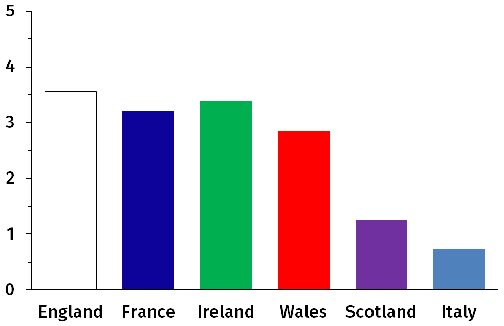
Figure 1: Average number of matches won per tournament.
Figure 1 shows that historically the Six Nations have really been the Four Nations Plus Two. England, France, Ireland and Wales all won around 2.7–3.5 matches per tournament on average between 2000 (when the Six Nations started) and 2018. On the other hand, Scotland is at 1.4 wins per tournament and Italy at 0.65. A draw is treated as a half victory, so that the total overall number of victories is 15 each year. (In this figure and others, the colour code is what you expect it to be.) The figure sets four nations apart, but it cannot do much to rank them.
The left part of Fig. 2 indicates that in terms of the average number of points they score per match, France, Ireland and Wales are close together, as are (at a lower level) Scotland and Italy. Where the Welsh do worse than the French and the Irish, and the Italians than the Scots, is in the number of points conceded. This difference is clear in the right part of Fig. 2, which shows the point difference (points for minus points against). England is noticeably above Ireland and France, who in turn do better than Wales. Whereas it is natural, based on Fig. 1 to lump England, France, Ireland and Wales together, Fig. 2 keeps France and Ireland together but sets England above them and Wales below. (Another way to look at it is that England is less efficient: despite scoring a lot more they win barely more matches than Ireland and France; and Wales wins barely fewer matches despite a point difference that is clearly worse.)
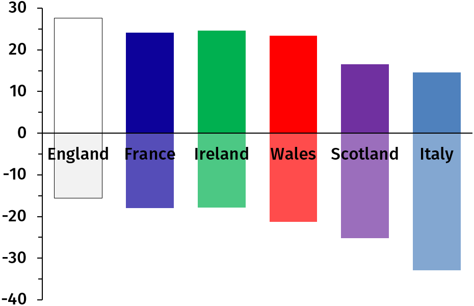
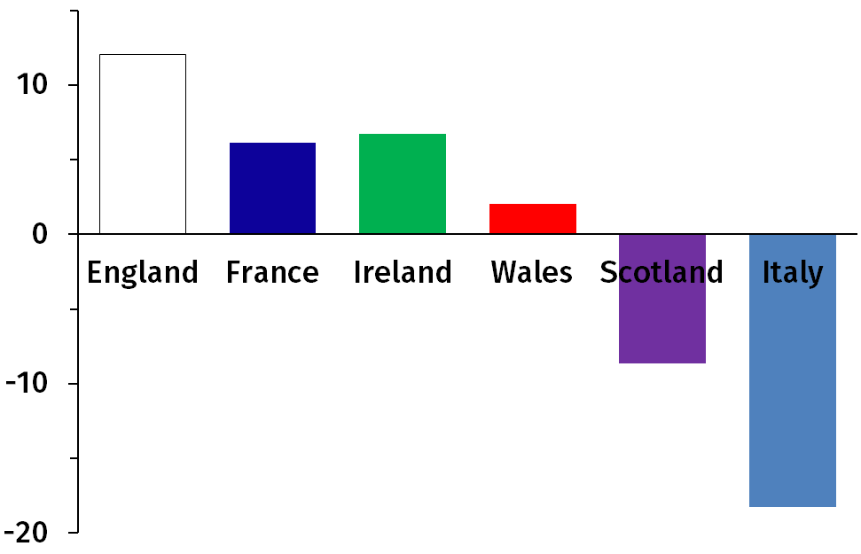
Figure 2: Average number of points for (above) and against (below) per match (left) and difference between for and against (right).
Figure 3 is similar to Fig. 2 but for tries. It shows the same pattern: England a bit above, Wales scoring about as much as France and Ireland but conceding more, Italy scoring as many tries as Scotland but conceding more too. The points and tries conceded give a clearer picture than those scored (except for France and Ireland which are tied).
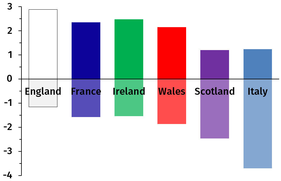
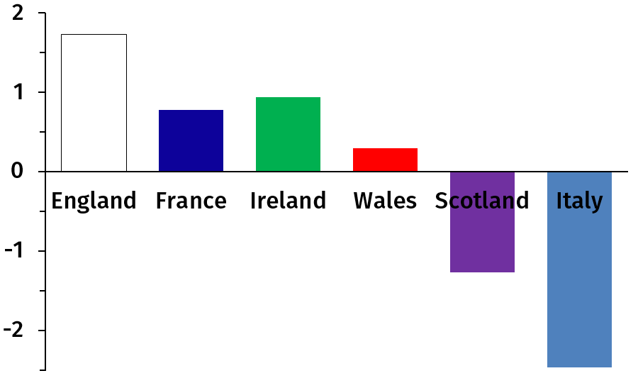
Figure 3: Average number of tries for (above) and against (below) per match (left) and difference between tries for and tries against (right).
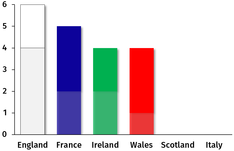
Figure 4: Number of tournament wins, with grand slams.
Figure 4 shows that England won the tournament 6 times, France 5 times, Wales and Ireland 4 times each, and Scotland and Italy never did (although Scotland won the Five Nations). Paradoxically the top nation, England, scored only two grand slams, like Ireland but fewer than France and Wales. A majority of French and Welsh victories were grand slams (60% and 75%), against a third for England (and exactly half for Ireland). England is the only nations totalling 4 non-slam victories (shown as grey or faded colours in the figure). Overall, out of 19 Six Nations Tournaments, there were 10 grand slams, a little more than half.
The overall hierarchy is thus: England, France, Ireland, Wales, Scotland, Italy.
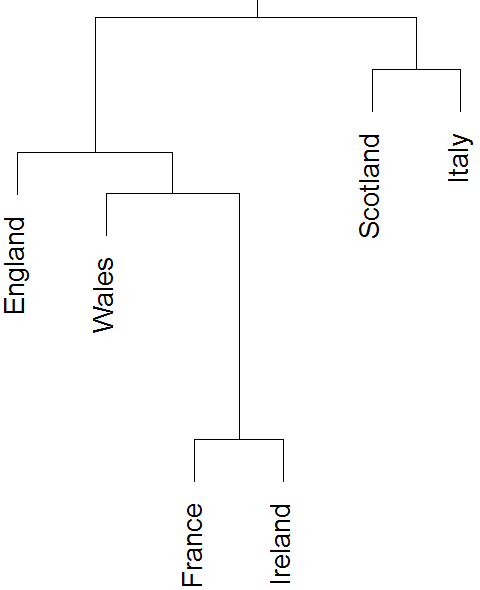
Figure 5: How far apart nations are.
Figure 5 is similar to charts showing that man is closer to chimpanzees than to gorillas, which both are nearer than other mammals, etc. This figure is not so much about a hierarchy between teams as about how easy it is to tell what the hierarchy is.
All six nations start together at the top of the figure, then some break apart from the rest. Figures 1–4 consistently set Italy and Scotland apart from the other four nations, and Fig. 5 shows that the Italy–Scotland branch of the tree splits early (at the top in the figure). The next event (second branching from the top) is the split between Scotland and Italy. After that England breaks from France, Ireland and Wales. France and Ireland are separated by far the last.
This reflects the way the nations were ranked using Figs. 1–4. All four figures plainly show that Italy and Scotland are weaker than the other four. But it is quite hard to tell France from Ireland.
How often a nation wins says a lot about it. But, could one paraphrase Anna Karenina's first line, that "All happy families are alike; each unhappy family is unhappy in its own way.", and ask whether all good teams or all bad teams are so in the same fashion? While you catch your breath after seeing a quotation from Tolstoy in an article about rugby statistics, I will turn to more qualitative differences, i.e. things, which unlike winning matches or conceding tries, are not intrinsically good or bad.
The best nations score more tries (cf. Fig. 3) and the weakest ones concede more tries. So all in all, the total number of tries in a match could just as well be the same regardless of who the teams are. The left part of Fig. 3 showed that it is almost true: the total height of the bars is stable; England, France, Ireland, Wales and Scotland are all around four tries per match (scored + conceded). And Italy truly stands out: a match with Italy is likely to have lots of tries (over 5, mostly against the Italians).
Some nations are supposed to focus on scoring tries, whereas others are content with winning matches three points at a time. In reality though, it is really mostly a matter of how good a team is: the top-3 teams of each tournament score on average over 49% of their points from tries (the rest coming from conversions, penalties and drop goals), against about 42.5% for those placed 5th or 6th (standard errors are under 1.5% for both groups). Within this clean trend, Scotland stands out as particularly apt at kicking (or inapt at scoring tries), with under 39% of their points coming from tries (next lowest is Italy slightly around 43.5%).
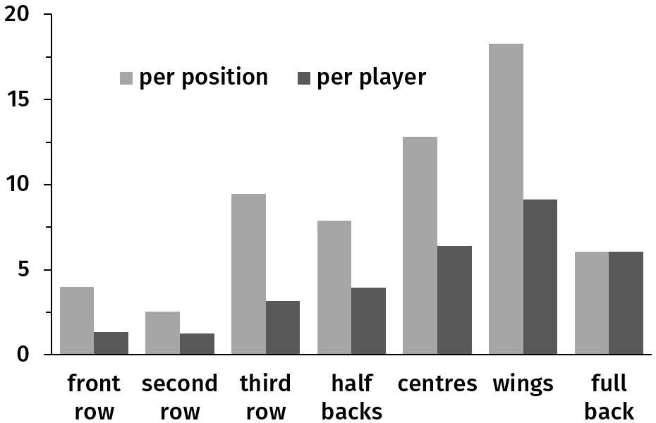
Figure 6: Average number of tries scored per tournament (all nations combined) by position. Light grey: all players at that position, dark grey: per player.
Figure 6 shows that, as can be expected, backs (and especially wings, with 18 tries per tournament) score the most tries. Among forwards, only the back row can compete with the backs: they account for 60% of forward tries (70% for England and 50% for Ireland), even though they make up only 3/8 = 37.5% of the forwards (I do not have data to break this down between number 8 and flankers).
But they do not do so fairly since there are three of them and only one full-back. The darker bars in Fig. 6 show the number of tries per player (e.g. dividing by three in the case of the back row). Wings are still on top, but centres are tied with the full-back for second place (i.e. one centre scores as many tries as one full-back). The back row do as well as the halves, and the front row as the one behind. This yields four groups in decreasing order of tries scored per player: wings; centres and full back; third row and halves; first and second rows.
(The breakdown of forward tries may be unreliable: many are due to a player carrying the ball behind a maul following a line-out or in a scrum at five, so who exactly scores that try is not very meaningful: it could be attributed to forwards as a whole; sometimes it is even hard to tell who scored, since half a dozen players are piled up on the ball.)
The left part of Fig. 7 shows what proportion of the tries scored by each nation were scored by forwards. Overall they score about 27.5% of tries. England and Wales rely less on forwards (i.e. more of their tries come from the backs). On the other hand, Italy stands out as counting more on them.
The right part of Fig. 7 shows the fraction of tries scored by forwards based on the rank of their team that year. On average 28% of the tries of the winner of the tournament are scored by forwards (very close to the average), but only 20% for teams ranked 2nd and 3rd. The bottom two teams rely most on forwards, who score a little more than a third of their tries.
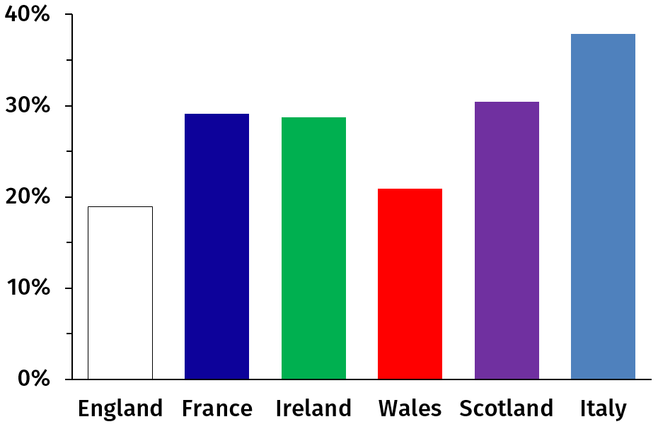
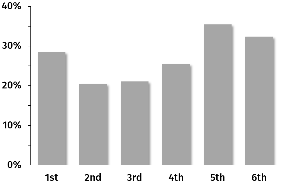
Figure 7: Fraction of tries for scored by forwards, ordered by nation (left) and by rank (right).
Looking nation by nation, on sees this same pattern: those years when it wins the tournament England scores a little more than 20% of its tries by forwards, but only a dozen percent when it ranks 2nd and above 20% when 3rd or 4th. Ireland also has a low point when ranked 2nd and France when 3rd. Scotland placed 3rd twice and its forwards did not score a single try these years (maybe Scotland should attempt to play without forwards at all, it seems to bring it luck).
The left part of Fig. 8 shows the success rate of kickers, by nation (averaged over 17 tournaments). Wales is at the top followed by Scotland, England and Ireland, with France and Italy lower. This does not correspond to the overall hierarchy, most probably because this is about a handful of players not a whole team.
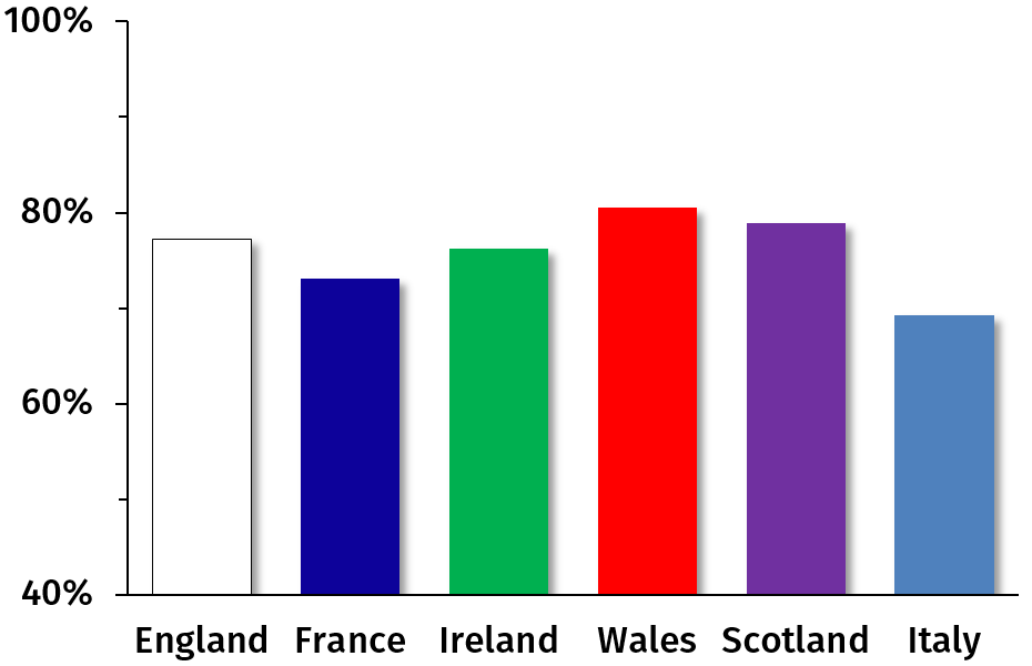
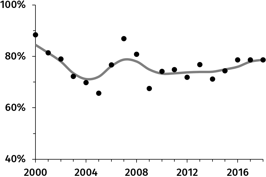
Figure 8: Percentage of kicking success by nation (left) and by year (right).
(The vertical scales do not start at zero.)
The right part of Fig. 8 shows the kicking success rate, this time by year (averaged over all nations). Success was high in 2000 and 2007 and particularly low in 2005 and 2009. This pattern is different from that observed in Figs. 13 and 14 (a change in one direction until 2013 and then a move in the opposite direction).
You would think that draws would not be a major problem in rugby (at least not a common one), but in fact draws are a mess. Historically, no team ever drew twice in a single tournament. No team ever had 4 wins and 1 draw either, so the best result with a draw was 3 victories, 1 tie, one loss — consequently no team with a draw that year ever won the tournament.
Numbers of draws are very low: 1 draw out of 5 × 19 = 95 matches for each of England, Scotland and Italy, and 3 for France, Ireland and Wales (so no nation drew exactly twice). Interestingly, when England drew they ranked 3rd; France ranked 3rd, 4th and 6th; Ireland twice 3rd and once 5th; Wales 2nd, 4th and 5th; Scotland 5th and Italy 6th. Clearly draws are found mostly at the bottom: winner and 2nd together drew once out of the 190 matches they played, 3rd through 6th together drew 11 times out of 380 matches. This gives averages per tournament per team of respectively 0.03 (standard error: 0.03) and 0.16 (standard error: 0.045). The difference between these two groups is significant, but there are too few draws to go beyond this (but ask me again in ten years).
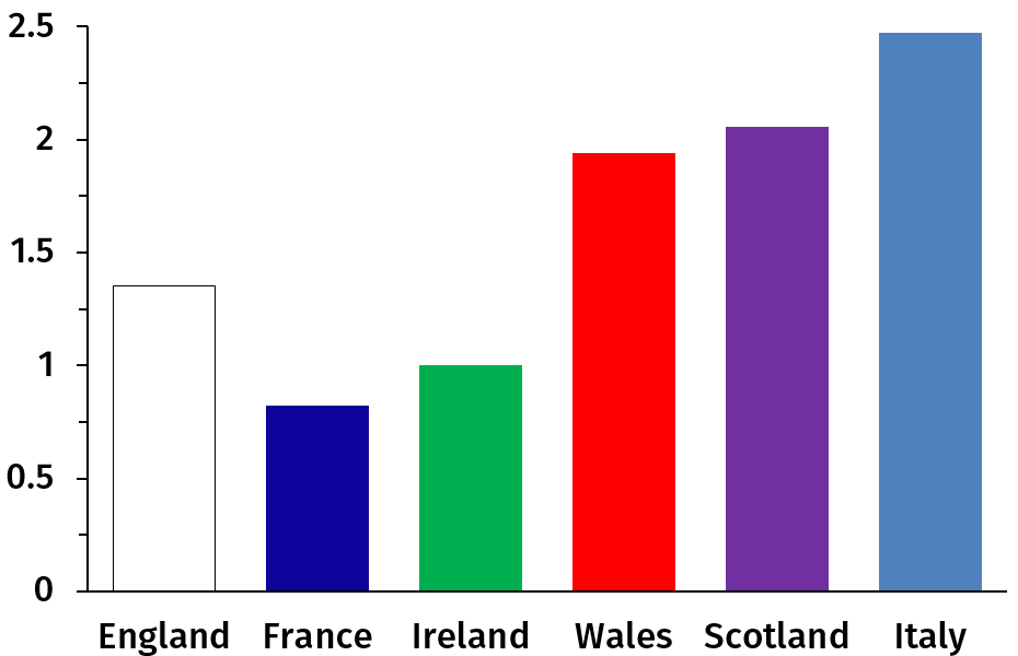
Figure 9: Average number of yellow cards per tournament, by nation.
As can be expected, the most respectful of the rules, nicest and calmest players are those from the Land of Ire and the French. Figure 9 also shows that Wales and Scotland are about tied and that Italy gets the most yellow cards.
Looking at the number of yellow cards received during a certain tournament against the rank of the team for that tournament, we find that the top-2 teams get on average 1.35 yellow cards that year, against 1.75 for 4th and 5th and 2.65 for the bottom team. The team finishing 3rd is lowest, at 0.85 yellow card. See below (Figs. 10 and 11) for more on yellow cards and rank.
A grand total of six red cards were given in 17 years (3 to Italy, 2 to Scotland and 1 to France, with half of these in 2014), so little can be said, except that this seems to follow a rather usual pattern: (1) Italy and to a smaller extent Scotland stand out for the worse and (2) half the red cards went to teams ranked 6th and none to the winner or 2nd.
Since each nation plays 5 matches per tournament, they play 3 at home one year and 2 the next. The average number of wins for nations playing 3 times at home that year is 2.55, against 2.35 for those playing away 3 times (the average is 2.45 rather than 2.5 because of draws). The Six Nations Tournament was won 12 times by teams playing 3 times at home, against 7 times by those playing twice at home. Things are even plainer at the extremes: the bottom team played away three times in 12 tournaments out of 19 (63%) and seven out of the ten grand slams were scored by thrice-home nations.
The home advantage is real, but not one-edged. Nations playing one extra match at home score more (22.75 points per match, compared to 20.8 with 3 away matches), but also concede a bit more (22.1 vs. 21.45), yielding a point difference of +0.65 against −0.65. The thrice-home teams also score more tries (11.15 per tournament, against 9.35) and conceded more tries (10.6 vs. 9.9), for a try difference of +0.55 against −0.55. So there is some home advantage, but also a qualitative difference of tactic: the home team seems to play more, thus scoring more but also conceding more. This is consistent with the fact that they score 49% of their points from tries, against 45%. (In order to be more specific, one would need match-by-match data, in order to check that the extra points and tries in fact come from the home matches, not from away matches during tournament with 3 home matches.)
There is a positive correlation between standard deviations (in tournament points, points for, points against) and grand slams (showing in the principal component analysis if you must know). France and Wales scored more grand slams (three each) than England (two) despite England doing better overall. This is because their results are irregular: some years they do terribly and some years they beat everybody. Indeed, England and Ireland (four grand slams between them) finished second of the tournament 15 times between them, France and Wales twice each; likewise the former two combined ranked fourth or worse five times against six times for France and eleven for Wales. France and Wales score a grand slam or die trying.
The tournament winner gets on average 1.4 yellow cards per tournament, which breaks down as 1.9 for grand slam winners and 1 for non-slam winners. The teams placing 2nd (1.25) and 3rd (0.85) are somewhat similar to non-slam winners, as the left part of Fig. 10 indicates. Teams ranked 4th or 5th are around 1.75 and the bottom team is at more than 2.6 yellow cards by tournament on average. There are three groups: grand slam winners are similar to teams ranked 4th and 5th, non-slam winners are with 2nd and 3rd, and 6th is on its own; this is plain in the right part of Fig. 10.
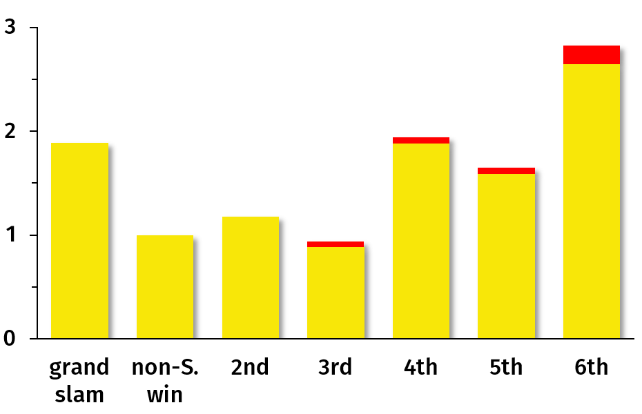
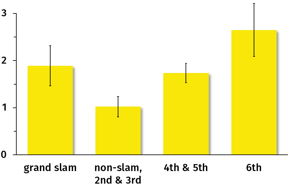
Figure 10: Average number of yellow and red cards per tournament, by team rank. The right part of the figure clusters ranks with similar numbers of yellow cards (the errors bars are one standard error).
Moreover, 1 out of 10 grand slam winners received no cards, against 3/9 non-slam winners, 8/19 for 2nd, 8/19 for 3rd and just 1 or 2 out of 19 for 4th+. On the other hand, 5 out of 10 grand slam winners received two cards or more (yellow + red), against 2/9 non-slam winners, 3 or 4 out of 17 for 2nd and 3rd and 8 or more out of 17 for 4th+. This is shown in the left part of Fig. 11. As with Fig. 10, cards are found at the top and bottom but not so much in-between: non-slam winners and teams ranked 2nd and 3rd get the fewest cards, as show the right parts of Figs. 10 and 11.
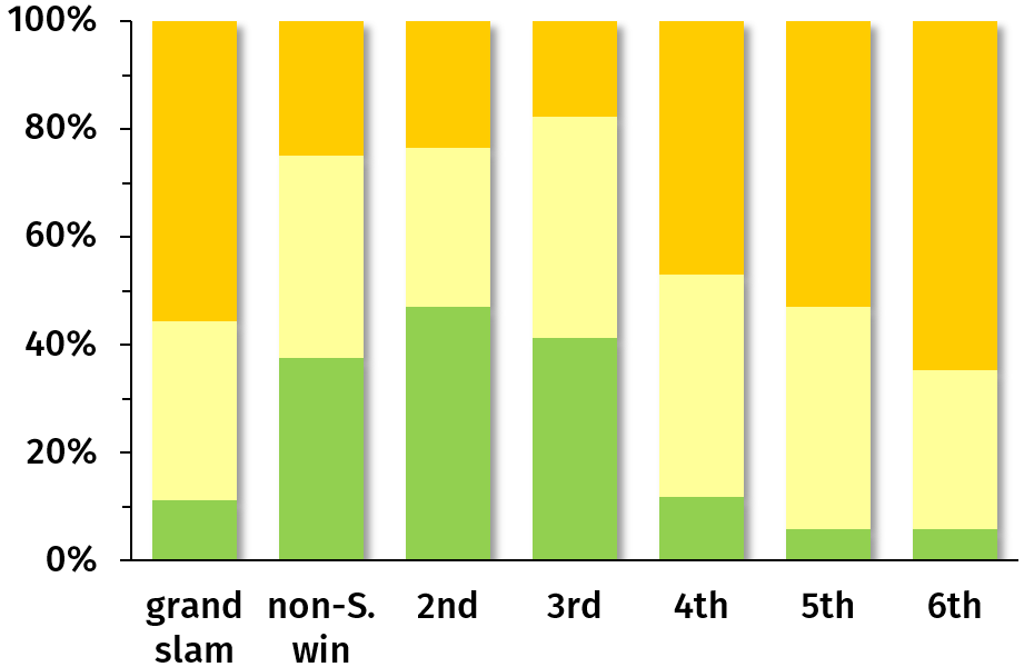
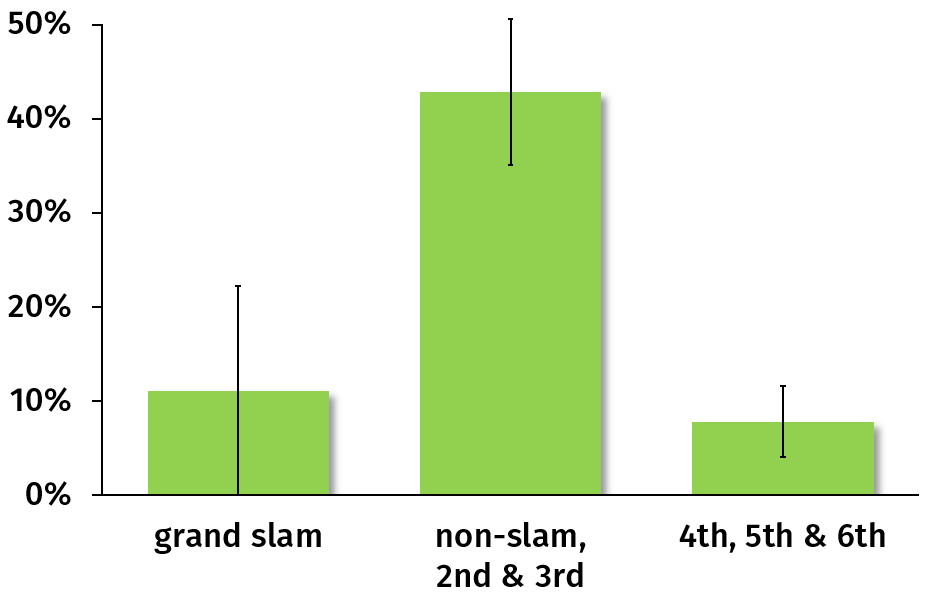
Figure 11: Percentage of teams of a certain rank getting no card, one card or two or more cards (from bottom to top) in an entire tournament. The right part of the figure clusters ranks with similar proportion of tournaments without a card (the errors bars are one standard error). (The two charts have different vertical scales.)
One can expect weaker teams to commit fouls when overwhelmed, and one can expect teams with cards to then concede more points. So it is not surprising to find more cards at lower ranks (as both cause and consequence). But cards seem more numerous at both extremes, not just at the bottom: Figures 10 and 11 show that non-slam winners, 2nd and 3rd are different from both grand slam winners and teams ranked worse.
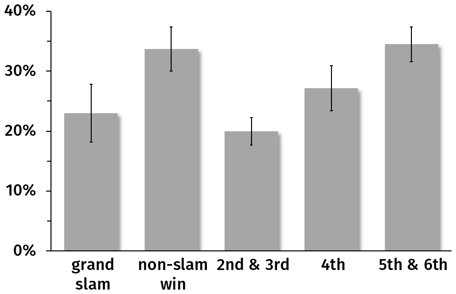
Figure 12: Fraction of tries for scored by forwards, clustered by rank. The errors bars are one standard error.
The right part of Fig. 7 showed that teams ranked 2nd and 3rd scored a similar proportion of their tries by their forwards, as did those ranked 5th and 6th; and the winners were in between. Figure 12 breaks down winners between grand slams and non-slam victories. The pattern is the opposite of that observed with yellow cards: grand-slam winners are similar to teams placed 2nd and 3rd, whereas non-slam winners are close to the bottom ones.
The difference is even more dramatic for the front row: 1.75 tries on average per tournament for non-slam winners, against 0.35 for grand slams, 0.5 for the 2nd and a maximum of 0.75 for the 5th. However, these numbers are a bit small to be trusted.
The left part of Fig. 13 shows how many points (in red) and how many tries (in green) were scored on average per match for every year from 2000 (when the Five Nations turned Six) to 2018. (In order to avoid plotting a jagged line because the number of points/tries varies too much from year to year, I include the data as dots and add smoothened lines.) The number of points per match decreased regularly from over 53 in 2000 and 2001 down to below 36 in 2012 and 2013. Likewise, the number of tries dropped from 5 per match in 2000–2003 down to half as many in 2013. Over the past five years both increased again.
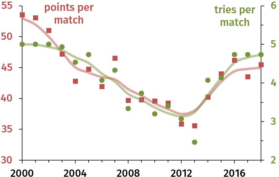
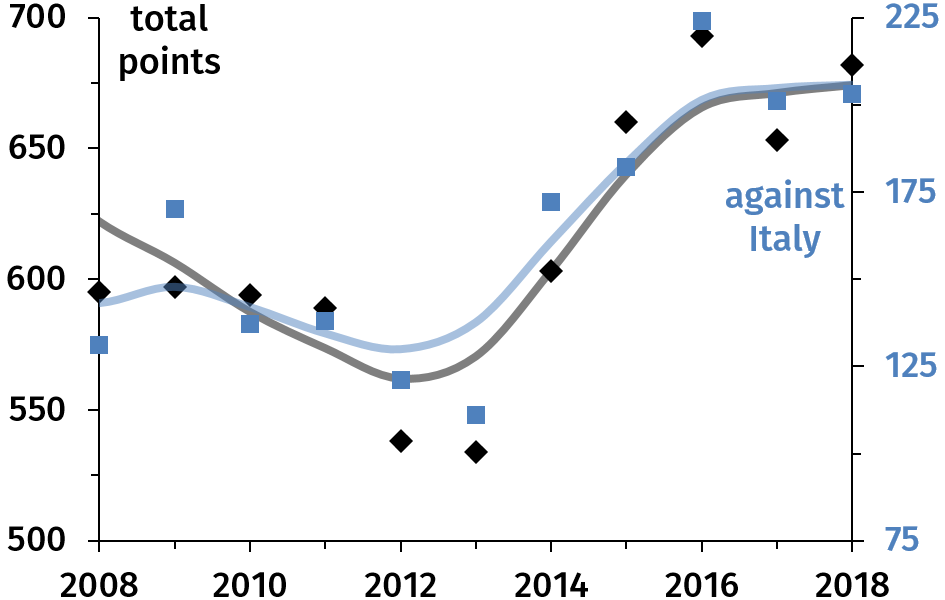
Figure 13: Left: Average number of points (red, left axis) and of tries (green, right) scored per match over 2000–2018. Right: Total number of points per tournament (black, left axis) and number of points against Italy (blue, right) over 2008–2018.
Why was there such a downward trend, and why did it end? A contribution to the latter is the number of points against Italy skyrocketing in recent years: from 22–28 per match in 2010–2013 to 34–45 in 2014–2018. This means an extra 100 points over its 5 matches in 2016 compared to 2012, as shown in the right part of Fig. 13. Points against Italy account for a good portion of the difference between 2012–2013 and subsequent years.
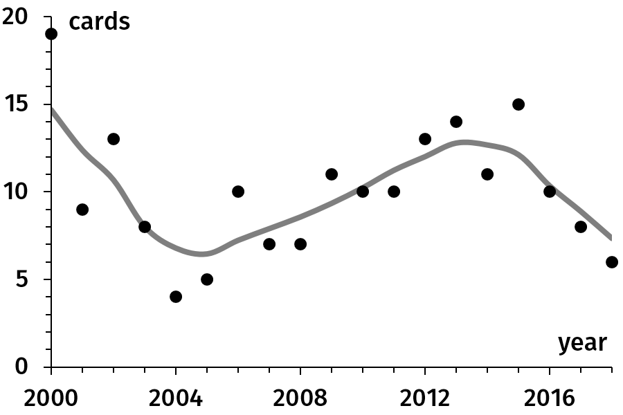
Figure 14: The time evolution of the number of cards per tournament.
From a high of 19 cards (yellow + red) for the 2000 tournament, the number fell to 4–5 in 2004–2005. It then increased again to reach 15 in 2015. (This may be due to changes in the rules, e.g. harsher treatment of dangerous tackles.) Since then the number of cards went down, hitting 6 in 2018.
Looking at both tries (and points) and cards, we can see three periods. Between 2000 and 2005 there have been fewer and fewer tries and cards. Between 2004–2005 and 2012–2013 the number of tries (and of points) kept decreasing whereas the number of cards climbed. Since then, there has been an improvement on both counts: number of tries nearly doubled and number of cards halved.
Figure 15 shows the number of points for (left) and against (right) each nation for every year from 2000 to 2018. As can be expected Italy and Scotland contribute more to the latter than the former, making up on average 24% of points scored and 44% of points conceded.
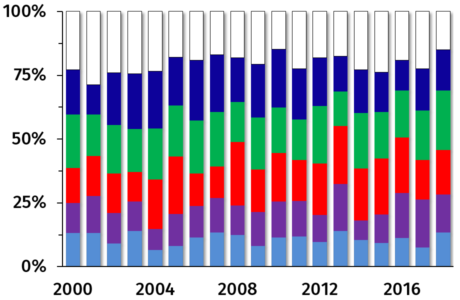
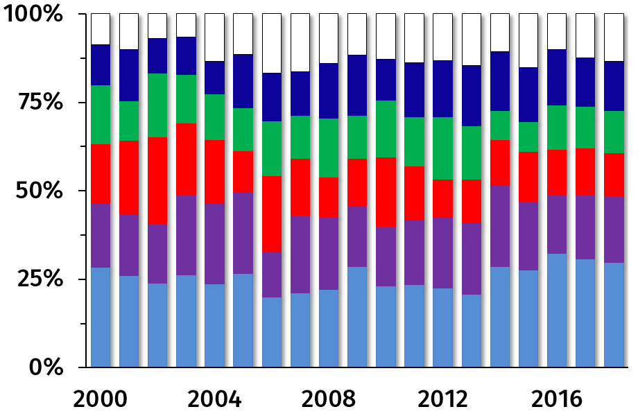
Figure 15: Number of points for (left) and against (right) each nation, as proportions of points scored that year.
The time evolutions of points for and against each nation sometimes tell interesting stories. For instance, in its two tournament victories of 2014 and 2015, Ireland conceded only 10–11 points per match, quite lower than its average of 18.
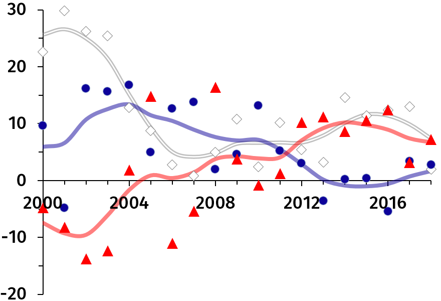
Figure 16: The time evolution of the point difference for England, France and Wales.
Between 2000 and 2003, the average score for England was 38.5 to 12.5 (even though France won the tournament in 2002). Between 2005 and 2008, it was 23.5–19. Although it recovered a little since, Fig. 16 shows that the English golden era of the early 21st century seems over. Note though that England is the only nation who never had a negative point difference in 19 years.
Over the past decade the French point difference decreased so much that, with the exception of 2010, it was close to zero or negative. Wales has been going in the opposite direction: the average Welsh score was 22–31.5 between 2000 and 2003, between 2004 and 2009 it looked more like yoyo than like rugby, and their average score was 26–15.5 over 2012–2016 (2017 is lower), yielding a consistently high difference over the period.
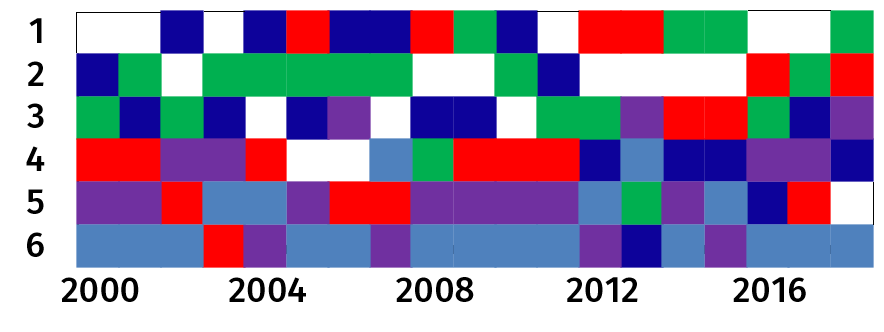
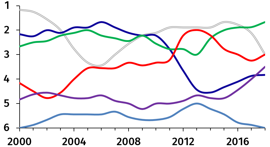
Figure 17: Ranking.
Since every year each nation has a rank between 1st and 6th and no two nations have the same rank, the ranks can be shown as a sort of tiling, as at the top of Fig. 17. The smooth lines of the bottom figure are less mesmerizing, but they give a more usable view of the evolution of the hierarchy.
Scots and Italians rank consistently low (with some improvement for the former over the recent years). The Irish too are regular, albeit at a higher level (ranking 3rd or better for 17 out of 19 years). The Welsh improved from no better than 4th between 2000 and 2004 to no worse than 4th over 2008–2016 (and until 2013 they did better than 4th only when they won the tournament). France was consistently in the top 3 up to 2011, before diving into the bottom 3 and staying there until 2017. England had never ranked worse than 4th until 2018; moreover, until 2003 and between 2011 and 2017 they were always in the top 2.
Figure 18 shows the point difference of one year against that for the year before. In the left figure, the data align about the diagonal, i.e. the point difference for a year is similar to that for the previous year. This, however, is misleading: it mostly means that those nations that have a positive (respectively negative) difference tend to again have a positive (resp. negative) difference next year. Looking at nations separately the correlation may disappear, as is the case for Ireland and Scotland, right of Fig. 18. While the Irish and Scots are extreme cases, the correlations for other nations, taken one by one, are not so strong either.
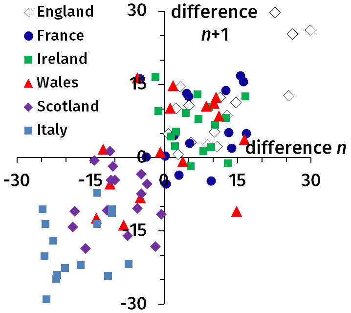
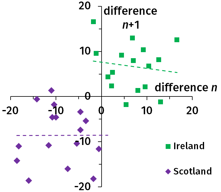
Figure 18: The point difference for year n as a function of the point difference for year n − 1.
The dashed lines are linear fits.
The trend in Fig. 19 is that the higher the point difference, the greater the number of matches won. This is anything but surprising. There is, however, a lot of variation, and a certain point difference may lead to completely different results. For instance an average point difference per match of +10 can result in a grand slam (2009 Ireland and 2012 Wales) or in winning just 2 matches (2005 England).
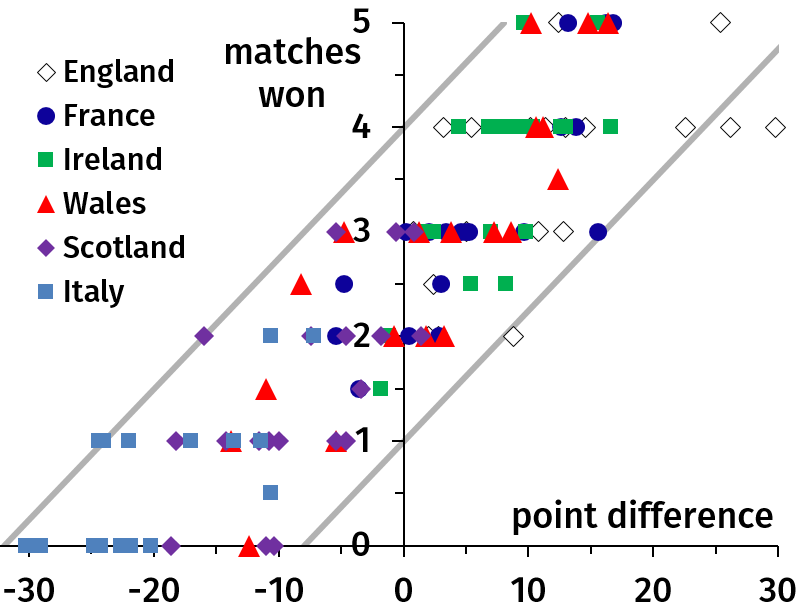
Figure 19: Number of matches won against point difference.
Data from: WorldRugby reports, Wikipedia, rugbyfootballhistory.com and statbunker.com.